Designing for mobile devices requires special consideration.
The Recommended Elements and Best Practices Checklist identified in the Introduction also applies to MSU web-based communications and interfaces designed for mobile devices.
Mobile and tablet screen aspect ratio and resolution vary across devices and operating systems. The layout and spacing information in this section provides guidance on placement and presentation of required elements on mobile devices.
12.1 Mobile Layout

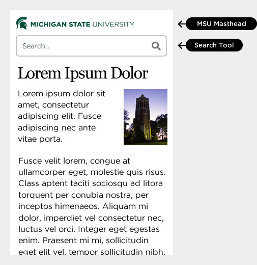
12.1.1 Checklist: Mobile MSU Masthead and Search Tool
- Align with top margin of the web layout.
- Vertically center the MSU Masthead and Search Tool in masthead region.
- Align MSU Masthead with left web page content margin.
- Align a Search Tool button with right web page content margin.
- Do not place any additional elements within or above this region.
- Do not fill the area behind the MSU Masthead and Search Tool with a background color or image that is different from the background used in the website’s design.
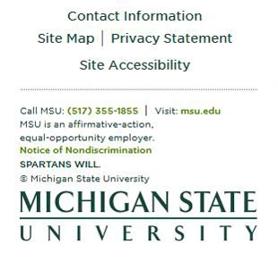
12.1.2 Checklist: Mobile Standard Footer
- Place below the web layout.
- Align your website information and horizontal rule with center of page.
- Align MSU main campus information with left web page content margin.
- Align MSU wordmark with center of page.
- Do not place additional elements within or below this region.
12.2 Alternate Placement of Search Tool For Mobile
You may place the search box below the MSU Masthead in place of the search button.
12.3 Mobile Design Best Practices
- Start with mobile layout first when creating a new website design.
- Place essential information and actions in upper portions of your layout.
- Style navigation and heading consistently on mobile and desktop.
- Style and position text and user interface to be visually distinct from one another.
- Use simple interfaces and interactivity.
- Make user interface large enough to touch (48x48 pixels minimum).
- Evaluate and test download speeds (more fonts and images mean slower load time).
12.4 Creating New Mobile MSU Designs
- Creating new and innovative mobile designs is encouraged.
- MSU Web Standards will be updated regularly to include new solutions.
- Please work with Comms (University Communications) if you have questions about required elements.